Process
REVIVE
Brand analysis
First, we went to Talavera de la Reyna in Puebla, Mexico, to immerse ourselves in the processes, design, context, people, and everything surrounding the brand.
We talked about the processes with the artisans, saw how long it takes to make the ceramics and for the paint to dry, and they shared useful techniques and much more with us.
Benchmark analysis
In this case, since it is such a well-known brand with a strong market presence, we did not want to analyze the competition but rather focus on maintaining and respecting the characteristics that represent Talavera de la Reyna.
Our goal was to strengthen the brand without falling into trends that would go out of style.
New Identity
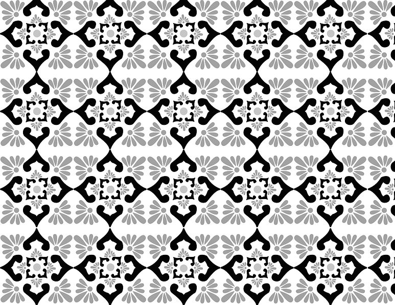
Define visual elements that artisans use as the brand's hallmark. Vectorize them, and with that, I began to play with them, creating textures.
With the textures, we defined which ones to use for different physical objects that would be used in product packaging.
Creating physical objects
We analyzed what type of packaging the brand would need and settled on three types: bag, square box, and tall box. These would be sufficient to package all the products that the brand produces and ships.